First Impressions Matter

Attention spans are notoriously short on the web. Users will minimize time spent by quickly scanning a site for useful or appealing content. By some accounts, users decide whether to investigate or move on within the first 7 seconds.
The homepage is often the first point of contact that visitors have with a business and that first view is a make- or -break moment. A design that engages visitors the moment they land on your site can get them interacting with and learning about your offerings.
Brand Identity
Think of your homepage as a virtual storefront. If it’s not obvious what your business does, visitors will simply walk by without taking notice. It should be immediately clear what you are offering and why visitors should care. Homepages are often designed with too many distracting elements like irrelevant pictures or too much text.
A Strong Site will~ |
|
|---|---|
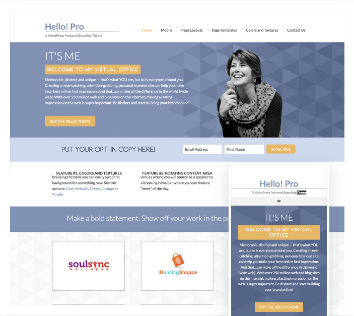
Feature Your Logo
This has the name of the business on it 3 times and the color reflected in the headline. |
Show Product or Service in Actiona person using your product, or feeling happy because of using your services, have an image that makes it crystal clear.
|
Lead with Strong HeadlinesHeadlines are another place you can be crystal clear about what you are offering. Use wording as if you are speaking directly to the user “We can help YOU”
The name of the business is prominent and the headline clearly tells the offering. The image of books gets the point across even without reading! |
Pay Attention to ColorThe psychology of color can have a huge impact on the look and feel of your branding.
Color can help establish the feeling of your page immediately. |
 Your logo should be prominently displayed. Not only is it a marker for someone who is trying to look you up so they can relate to something familiar, but it can really convey the feeling of your offering, if only by color and line, and shape.


Simplicity is Key
Think of a Kid’s Book
Users tend to scan pages for images and headlines- not reading the smaller text. Use simple statements and back them up with images. If someone wants to read about your educational journey, let them go to the “about”page to do that. Underwhelm them with details and overwhelm with your offer.
- Use bold headlines
- Use subheadings
- Use bullet points instead of paragraphs
- Write direct and effective copy
- Leave space (not only is is better design that scales to phones easier- it’s easier to read so it increases comprehension and gives the user a feeling of spaciousness.)

Highlight Your Credibility ~
A Picture of You or Your Product
As a therapist, people want to connect with you. The quickest and easiest way for them to relate to who you are as a person is to see a picture. Sometimes they aren’t sure you are the exact person that they met before. A picture solves that immediately.
Some Testimonials
Include a photo of person giving testimonial and clients or customers using your services. This collection of photos from Square’s homepage has a consistent style and clearly shows the product in action

Company Logos

When a business hires you or your company it’s an endorsement of your expertise. A stack of logos of companies that you have a relationship with is very impactful.
Your Homepage is THE most important page on your site, and can easily make or break your connection with new people. Change it often and experiment. Look at your analytics to see if the changes have had a negative or positive effect.
What does this mean? Simply put that bounce rates are highest within the first 10 seconds. That means you only have a few moments to make a great impression on your visitors.
So how can you reduce the high probability of visitors leaving and actually get them to check out your content? It starts with a compelling design that engages visitors the moment they land on your site.